Define the visual properties of objects
Topics in this section
- Introduction
- Graphic attributes panel
- Properties bar
- Layer
- Fill
- Line-type
- Arrow-heads and markers
- Pen-weight
- Shadow
- Copy and Paste properties
Introduction
Most of the attributes common to all object types can be set and changed in the Properties Bar and in the Graphic Atributes panel. Properties that are shared among most object types are: layer, pen color, fill color, pen line types, start and end markers, pen weight, shadow.
To set the properties for new items, make sure no object is selected and then use the controls on the bar or in the panel. To edit the properties of an object, select it and then change the corresponding values.
Graphic properties specific of some objects, such as extension lines of dimensions or hatches and fill color of walls, are managed through their Settings window.
Graphic Attributes Panel
The Graphic Attributes panel supplies the graphic features of project elements, including stroke and fill attributes: it also provides the Shadow settings section. Information about Layers are not listed in this panel.
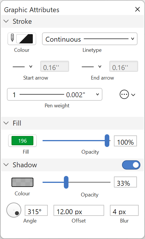
The Stroke section contains Pen color and Line-type menus, Start arrow and End arrow options, the Pen weights menu and the Cap and Line Join options of linear elements.
The Fill section displays the Fill color pop-up menu and the Opacity control to change the global opacity of the fill.
The Shadow section provides the options to customise this graphic attribute of objects. Clicking the switch button enables the shadow attribute and its options as well.
Layer
Although layers are not graphic attributes per se, yet they can alter the visual properties of their objects significantly and thus mentioned here. The Properties bar includes the Layers menu which you can use to quickly set the current layer, change its options and set the layer of the selected objects. More options are available on the Layers panel and the Layers Manager window.
Stroke Color
Use the Pen Color pop-up menu to select the current pen color or change the color of selected items. Pen color controls the color of the outline of objects.
Pen color can be selected as:
- By layer: the object uses the color defined by its layer.
- Contrast: a variable color that always contrasts with the background of the page. On printouts it is always black as the background of the paper is assumed to be white.
- None: makes the outline of the object invisible.
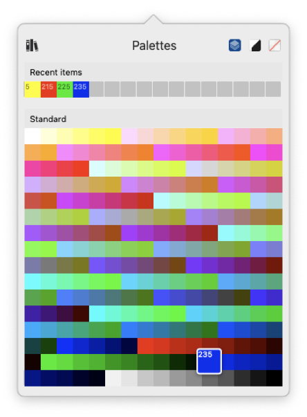
- Indexed color: you can select any color from any active palette. Recently used colors are listed in the Recent items section. This section is always relative to the current project and is empty in new documents.
The Resource Manager icon on the top opens the Colors & Pens Manager panel: use this panel to add new palettes or associate pens and colors.
Fill
The Fill Colour pop-up menu controls the options for filling a shape with a colour or a gradient. The button is active only for objects that have the fill property, like poly-lines, polygons, fills, arcs, circles and ellipses curves and walls.
The fill property of shapes and elements can use one of the following methods:
- Indexed colour
- Custom colour
- Gradient
Use the navigation icons on the top hand side of the panel to access the sections, in order, for palettes, the custom colour selector and the gradient editor.
Indexed Colour
The Palettes tab works in the same way as the Stroke Colour panel: choose a colour from any of the active palettes to use it as fill colour. Any associated pen weights are ignored.
The Palettes tab on the Fill popup also includes an Opacity slider that controls the overall opacity of the fill.
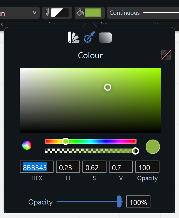
Custom Colour
In addition to indexed colours, you can also define a custom colour. The Colour pane includes the following items:
- No colour button: press this button to remove the fill.
- Colour value selector: the rectangular area at the centre of the panel shows the current colour in varying degrees of saturation and intensity. In the HSV colour model, this selector controls the S (saturation) and V (value or brightness) values.
- Colour hue bar: the multi-coloured bar below the value selector allows to select the desired shade of colour.
- Opacity bar: controls the transparency of the colour in a range from 0 (completely transparent) to 100 (completely opaque).
- System picker button: the multi-coloured circle at the left allows you to define colour using the system colour picker.
- Value fields: these fields show the numeric representation of the colour in hexadecimal format (HEX), in the current colour model (HSV, RGB, CMY), and the opacity value. Click one of the HSV/RGB/CMY labels to switch the current colour model.
The Opacity slider at the bottom hand side of the panel controls the overall opacity of the fill and is independent from the colour opacity.
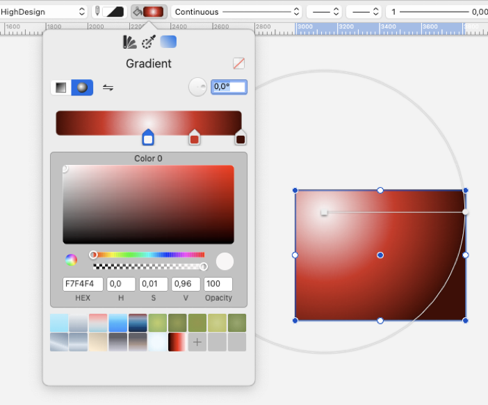
Gradient editor
The gradient button on the Fill menu opens the Gradient Editor. A gradient is a fill that varies its color from a start color to an end color, with variable opacity. Available gradient types are Linear (or axial) and Radial, and can be activated through the buttons on the top left hand corner of the window. The Invert Colors button, inverts the order of the colors in the gradient slider.
The Angle slider and field control the angle between the start and end points of the gradient.
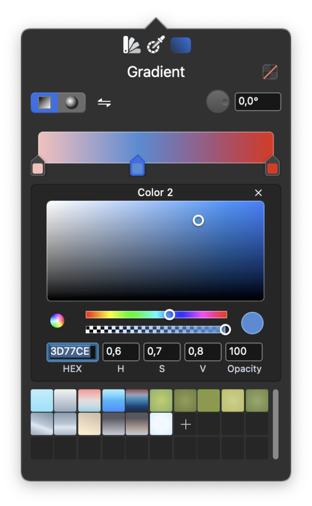
The Color slider controls the “color stops”, that is the colors and their locations along the axis. Select a color to use the color picker and adjust its values and opacity; click on the slider to add a color; drag a color along the slider to change its location; click the “x” button to remove the selected color of the gradient.
- Changes are visible in real time.
- The geometry of a gradient, that is position of the handles (end points) and radius of the circle (for radial gradients), can be edited by selecting an object with a gradient and adjusting the handles on screen.
- The Presets section at the bottom provides default gradients and the option to save the current settings as a preset that can be reused in the project.
- Click the “No Color” button to cancel the fill/gradient attribute.
Linear Gradient
A linear gradient is an interpolation of color that varies along a line between two defined points. When you select an object with a linear gradient, a line with two endpoints marks the linear gradient. You can edit each point and adjust the gradient as needed.
Radial Gradient
A radial gradient is a fill consisting of a progressive transition between two or more colors that radiate from an origin. Once created, the gradient has its origin, corresponding to the start color, in the center of the filled object and its end color in the nearest border or side of the object, describing the radius of the gradient.
To edit the gradient move and adjust the circle visible when the filled object is selected: move the start point or center of the gradient, marked with a square handle, to move the gradient and move the end point to adjust the radius.
NOTE Due to the underlying graphics engine, gradient colors with varying opacity cannot be printed or saved as PDF. On print or PDF, such gradients are rendered with an opacity value of 100%. Anyway, it is possible to change the global opacity of the fill through the Opacity control of the Graphic Attributes panel: this way the global opacity of gradients can be exported as PDF. Also, for output consider image formats such as TIFF, PNG or JPEG.
Line-type
Use the Line-type pop-up menu to set the current line type or edit selected items (when applicable). This pop-up menu lists all currently loaded line-types, each with its own index number.
Apart from the Continuous line type, all other lines have the Line Scale Factor, expressed in percentage, to proportionally modify the size of dash and space and the extent of special lines.
The Line-type menu also provides the option to open the Line-type Manager pane of the Resource Manager window to manage existing line-types or to create new ones.
Arrowheads and Markers
Object vertices, such as lines, poly-lines, ovals, etc., can have arrows and other markers.
To set or edit the current object marker, use the two marker pop-up menus: the left one controls the start point of an object (Start arrow), and the right one controls end points (End arrow).
A slider on the bottom of the menu allows you to set the size of the arrowhead.
Pen Weight
Use this pop-up menu to set and edit the current pen weight from a list of 22 different values, expressed in millimeters.
To change an item’s weight, select it and choose the new weight from the menu.
- Because of the resolution of the screen (72 dpi), pen weights cannot be displayed on screen exactly as they look on printouts; when the Actual (print size) Pen Weights mode is on, HighDesign displays the different pens on screen with an approximation to their real print size. When the Bitmap mode is active, pen weights are displayed with a simple progressive pixel size.
- To change the way pen weights are displayed on screen, open the HighDesign Preferences window, select the Drawing pane and choose one of the three options available for pen weights or click the button on the lower right hand side of the main window.
- In printouts with low quality paper, pen weights may be a bit different from those chosen on the menu. The optimal print resolution is 600 dpi on high quality paper.
Shadow
The graphic elements of the project can have shadows, managed through the Shadow section of the Graphic Attributes panel. Shadows are applied to the single elements by clicking the switch of the section.
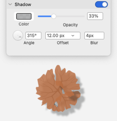
The options include:
- Color pop-up menu and opacity control.
- Angle control, to set the direction of the shadow.
- Offset of the shadow (you can choose “By Project”, using the project scale and units or “Pixels”, using real scale graphic units).
- Blur to soften the edge of the shadow by changing its range.
Copy & Paste Properties
With this command all the properties of the selected item are copied and stored for later use. This function applies to layer, color, line-type, weight and arrowheads. Copied properties can then be applied to other items of the drawing.
This tool can also be used via a keyboard equivalent: Option-click an item to activate it.
When you have copied the properties from an object, you can apply them to other objects. When the pointer is over an item the cursor changes to a paint bucket: click to apply the properties to that item. Click in a void region to quit the Paste Properties tool.
This tool can also be used via a keyboard equivalent: Command-Option-click (Mac) or Ctrl-Alt-Click (Windows).